
Thursday, September 6, 2012
Line mounts
So I'm just getting started in the process of finishing up my line compositions. Hopefully I'll finish mounting them today.

Tuesday, September 4, 2012
Kimberly Torres 2D Design
Homework: Design Basics / Line Qualities
Define:
visual unity:
when the whole must be seen over the obivious parts of the image. Some parts may seem like they belong to bring the image together, but if you only notice the smaller parts of the whole then it lacks unity.
Gestalt:
A design or pattern that cannot be understood with its obvious given visual elements
Harmony:
Elements within a design that look as though they belong together or have come together by mere chance.
List and define at least 6 ways to achieve visual unity, and explain each one:
(you can draw a little diagram too, if you want to)
Proximity: is when an image makes separate elements look as if they belong together by simply puttying them close together. You can achieve proximty through use or light and dark values, proportion when ever things a larger up close and gradually becoming smaller, collaging images together.
Continuity: something that continues within a design, such as a line, an edge, or a direction from one form to another. Continuity can be seen in figurative drawing, tesselations, a grouping of images that have the same subject matter but different style of the subject, griding technique, they could also be seen on company labels.
repetition: something that repeats in various parts of the design to relate the parts to each other. Ex: color, shape, texture, direction, or an angle. This can be seen in in nature or in natural sculptures, themes within an image, repetition of line direction such as diagonals, manipulation of space, similar strokes or textures.
emphasis: when including repetition and variety, this shows more of what element is used such as color or form. This is shown when something is heavier in size, darker in color, a balance between dominant and weaker forms, using a focal point for the viewers eye to focus on, when something in a design stands out.
chaos and control: without unity, an image or design can become chaotic or “unreadable”. Without some elements of variety, an image becomes uniteresting or lacks something. When a design has too much going on at once, colors are to bright and conflicting, the design is dull,
the grid: gives visual unity with the element of repetition, but when a slight change of color/value or change in shape makes it more intresting to the viewer. This would be used for textile patterens, print patterns, collages, checkerboard pattern, internet websites, and articles.
Kimberly A. Torres
Heather Ujiie
Foundation Design
8/28/12

This shoe uses the basics of form, line, and color. These
three things are what make up the basis of this shoe but when you see it from
the perspective of unity and its correspondent’s, then you’ll begin to see the
more in depth features of the shoe. The intricate stitching on the shoe shows repetition
in the circles, since there are circles within circles. The texture on them
plays a key role because the material makes the form of the shoes more unique.
What also makes these shoes interesting to look at is the color scheme being
used. Since all of the colors being used are very vibrant or “loud”, it gives
this shoe chaos and control since there’s a lot going on with the shoe.
“The Grid” technique was possibly used for these
shoes to show off the pattern that was used on the shoes. These shoes intricate
stitching resembles a woven basket or a wicker chair and with the bright color
scheme it draws in more attention for it to be noticeable. This object and
another one of the shoes created by the artist Olek will show proximity since
they all resemble each other one way or more and putting them will create a
sense of unity. Continuity is also very prominent because with this shoe
and long with the others that were created all share the same design, subject
matter, and medium used.
"Achieving unity in your compositions will only result from practicing, knowing and selecting the right visual elements and using the best principles of design to relate them."
I chose this quote in particular because when you first try to use this concept, it is pretty tricky to know exactly how to utilize each element. while using these elements you would have to know the difference between each of the elements such as: Balance, Movement, Emphasis, Contrast, etc.
As you practice with these one of the key things to remember is individual elements within as work of art should not be competing for attention and the main theme that is used should be understood very clearly.
I chose this quote in particular because when you first try to use this concept, it is pretty tricky to know exactly how to utilize each element. while using these elements you would have to know the difference between each of the elements such as: Balance, Movement, Emphasis, Contrast, etc.
As you practice with these one of the key things to remember is individual elements within as work of art should not be competing for attention and the main theme that is used should be understood very clearly.
My Henna
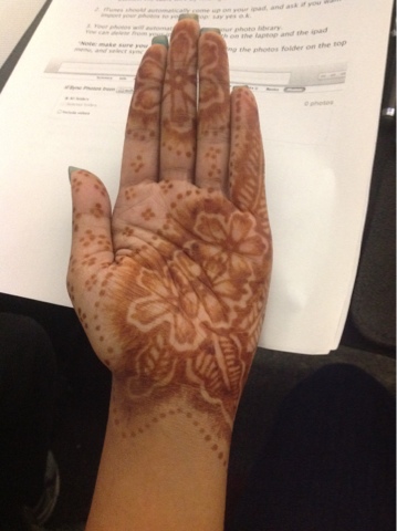
Just recently I've been wearing and also doing my own henna designs. I started doing thing because the process is actually quiet relaxing once you get the hang on using the henna but also it's also beautiful to wear. this incorporates with the class because since this IS a design, some aspects of it use the principles of unity. this one in particular uses balance since i placed the flowers in two different spots on my hand and the amount of flowers i used also plays a big part in this. this is also one of the few that I've done, i will possibly post more pictures up of my other designs in the future.


.jpg)
.jpg)
Subscribe to:
Posts (Atom)